Sunday, December 18, 2011

December 18, 2011 - Copics and Martha Stewart Craftstation

Okay, so it's been a long time again.  I'm not naturally a blogger.  For me, it's another chore.  But that doesn't mean I want to give up being a blogger.  I just want to get better at it.  My hat is off to those of you who keep your blogs updated with useful and helpful information.  It's not an easy task.

I've learned a lot over the last months, and I'd like to say I've got lots of hints and shortcuts and how-tos.  I don't.  My use of Copics has improved dramatically, but, like so many other things in life, there are no secrets.   It takes practice, patience and -- lots of markers!!!

I've tried and tried techniques to get the shading/blending with just a few markers and they fell lacking.  I'm open to learning new things, but with the copics you get spoiled.  There are so many colors.  If you're a real color enthusiast, you learned early on with coloring books that it's the blending and shading that makes the picture prettier.  And who didn't want the 48-count box of crayons?  Flat colors just don't work.  Without a range of colors you cannot get the desired effect.  Buying two or three markers in various shades had me about to pull my hair out because I was fitting my picture to the colors rather than the colors to my picture. 

So because I can tend to be self-indulgent when it comes to my various crafting habits, and I have been spoiled, yes, ruined by copic markers, and I now have the ENTIRE set of markers.  Even with sales, coupons, and discounts, that's still a large chunk of change.   However, you will see in the attached pictures what a difference it has made for me.  Whenever I complete a project now with the exact shading, blending, and colors I desired, this was money well spent to create my own little work of art*.

*Before you judge, I have never been on a cruise (afraid of large bodies of water, but no matter, I've  never been on one) and I've never purchased a pair of shoes over $100 and never will (that's just plain ridiculous to me, if I paid $200 for a pair of shoes I'd them expect to do something other than sit in the closet when I'm not wearing them, like maybe, clean the bathroom), and I very seldom eat out.  P.S. (Note to family: When I die one of these "little works of art" will cost wayyyyyy more than I spent on markers (LOL)

So here are some recent projects.  I'm still learning and will continue to share as long as my 5 faithful followers follow.   And I'm still hoping you all will continue to grace me with your wisdom regarding copics 'cause I'm not there yet. 

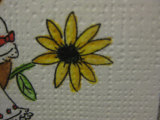
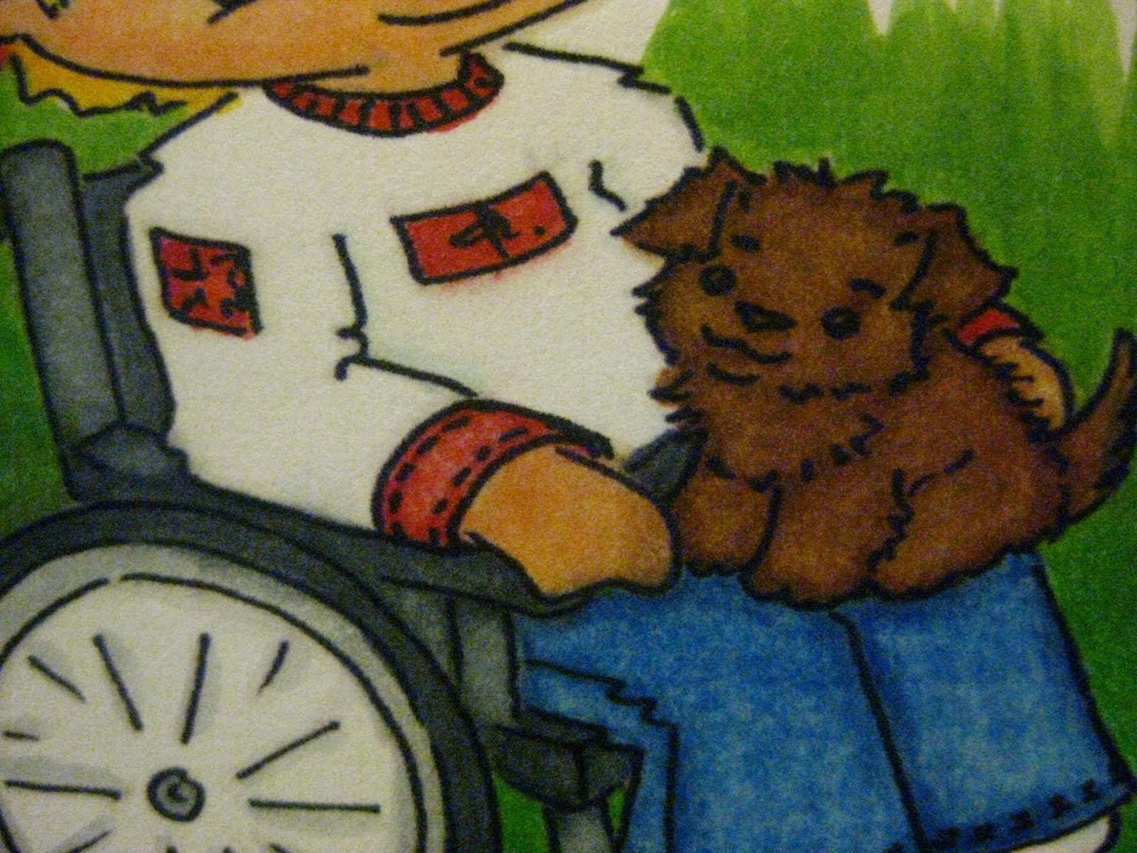
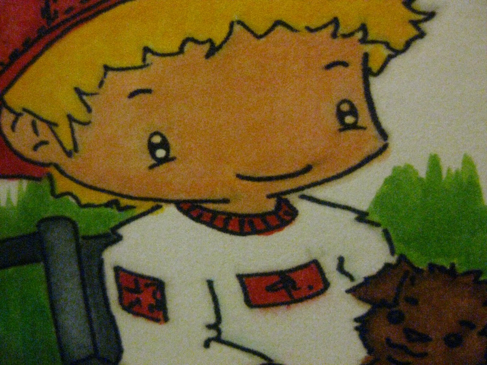
Working on skin and hair colors :


"Friends" Sooooo cute!


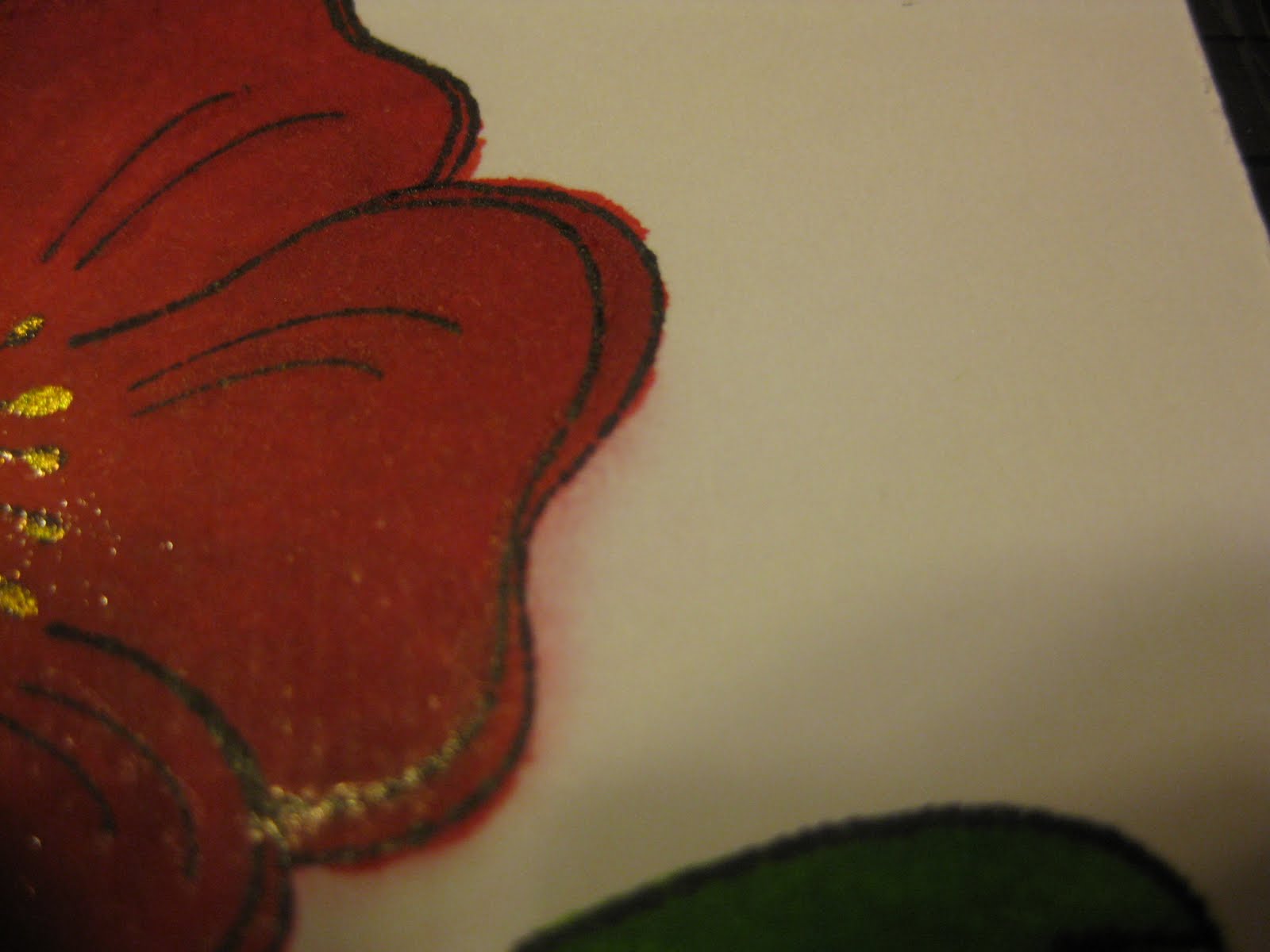
Some circles to use on the front of cards.


Hope you can see improvement.  Please feel free to make comments.  I learn from them, positive or negative.  If there's something you would like to see here, let me know.

Leaving you with some helpful enabling.  There are two books on the market about copic coloring.  The coloring with copic book for me has not been that helpful, seems to contains the same information I've learned on the MB and Youtube.  If you really want it, look for the sales and discounts.  I was able to get it for $8.99 plus free shipping.

The other one about coloring techniques is a winner.  It covers several mediums like markers, pencils, and watercolor.   So if you have to decide between the two, go with the coloring technique book.  It has much more helpful info for about the same price.

Because there have been questions about it on the MB, I'm including in this post some pics I posted on the MB of the MS Craftstation.  I absolutely love it.  You can do lots of different tasks without having to change out mats.  It's made of glass so you can use your exacto knife, draw, trace,  and it comes with interchangeable templates to slide under the glass, including two grids, and it cuts.  Will tell you more if you'd like.

What's included:


Some of what you can do with it. 

Cut
 
Trace
 
Embossing
Stamping

I have some cards I'd like to share with you, and I promise it won't take me long to get back, say within a week.

Thanks for stopping by :)

Friday, October 14, 2011

Still coloring with copics...less is better

Some of this post was shared on the MB.  It may sound
familiar but it's actually very different.  And I have swatches
to share. 

This is why you don't saturate your paper with the colorless
blender when trying to clear up oopsies.  It makes it so
much worse.   Less is better.  You clean up a little bit, let it
dry, and then come back.  You can always clear it up some
more later, as many times as it takes to get it clean.  If this
was a project, I would have tossed it and started over. 
Since I'm learning how to work with the copics, I stayed
with it.
Another reason why the paper you used is so important.   I
used a textured paper which gave the paper "channels" for
the ink to run into.   Makes it much more difficult to push
the ink back into the color.   
Especially on curved outside areas. You have to work it
from all angles.  If there were no "channels" you could
simply push it back with the tip of your pen in one
direction.   I love to use textured papers, so I've got to stop
with the oopsies, especially with the darker colors like reds
and browns.
 
Patience pays off.  These are close ups after the clean up.  I
worked with the side some more because if you look close I
lost some of the color.  I had to go back and add some color
and then try to finish cleaning it up. 

It's a lot of work, but the only difference between skilled
and unskilled is that the skilled continues to practice.    Do
you think Venus and Serena Williams hit every ball
perfectly every time?  Of course not.  Anything you want to
do well requires practice and occasionally you're rewarded
with something like this:

This little fellow is a Gruffies stamp.   I love pizza so I was
glad to get this stamp and had a lot of fun coloring this
little guy. The boxes did not come out quite as white on this
one.  There's an article in Cardmaker magazine in the
current issue on coloring white and some good videos on coloring white on
 YouTube.
 

I love templates.  This green flower below was made from a
template from Paper Wishes.   Sometimes I find it relaxing
to cut out a template by hand and put it together.   What
does this have to do with copics or coloring? 
 
I have several papers that I don't use with my Cricut because it's white on one side.  You can see the white back in the top picture.  Even if I print with the Imagine I will still have a white surface that I would prefer not be visible.  I traced and cut out the strips for these flowers, matched the color with one of my markers, and colored the backside.


All markers my not work, though.  Some of them are  too
"wet" and could bleed and make a mess on the other side.  I
used a copic to match the lighter green.  It dried fast, didn't
bleed, and there's no hint that this paper was once white.  I
used the same one to color the brad (it was yellow)  and gave it
a marbled effect, making it much prettier.


Well,  I'm off to practice.  Thanks for stopping
by.  Hopefully you've found something useful.  Feel free to
leave your comments, suggestions, or advice. 
They are all appreciated.  HTHS

Friday, September 30, 2011

Hey...

... you guys.  My garden has been a little neglected but that doesn't mean I haven't been busy.  At this point in time I am able to focus more on my hobbie activities than ever before.   I have built up quite a collection of things over the last two years in anticipation of this freedom.  Therefore, I have all kinds of crafting stuff, kits, cards, stamps, and I have tools of all sort...in short, I've got a lot of stuff, and I intend to have as much fun as I can with them.

It's not appropriate to share this type of info on PC's MB.  But I can here!  Reality is we have questions sometimes about non-PC products.  As I work through, I will share here what I learned in the process or experience and maybe it will help you answer some questions you may have about different products.   If you want to ask me about something specific, if I'm familiar with it I will let you know what I know about that product.  My opinions are not considered an endorsement for these products, just me telling you what I (me, myself, I) think about a product I've used.  If I like it, I will tell you I like it and why.  If I don't like it, I will tell you I don't like it and try to tell you why I don't like it.  My liking or not liking a product is based on what my particular needs are and that's all I can share with you.  It's always a good idea to research any product you purchase to minimize the chance of wasting your money.

Here's a treat.  It rained for most of the weekend, but I was able to share this moment with a 5-year-old.  It was her first real one.  Oh, we jumped up and down, we ooohhh and awwed, giggled -- oh, what a joyful moment.  We danced like nobody was looking! :)


Got lots of  copic swatches to share. So please check back.  I think I have developed a "solution" to one of copic problems.  Haven't seen it anywhere so far. They say necessity is the mother of invention.   And you know with me, ways to cleaning up a mess is crucial.   No matter how perfect I try to be I still make oopsies.  So I need ways to clean up those oopsies rather than start all over.
Thanks for stopping buy.  Will have more copic stuff up in the next day or so.

Saturday, August 27, 2011

My new Copic colored baby...

Hello.  Thanks for stopping and taking the time to read my post.  This is my newest copic coloring project.   It's another digi from Sliekje's. 


Isn't this just the cutest thing!  And what a positive message it sends.  I'm happy to be able to share it with you.  

I colored several versions of this little digi and then tried to pair it with papers.  Not so easy.  So I decided to pick the papers first and then pull colors to use with the stamp.

I've been using your suggestions and things have improved, somewhat.  Still seem to be having problems with the lighter skin colors being too orange. Arlene at Color Me Copic has a video on skin coloring that is awesome.  It has made a tremendous difference.  Still a work in progress. She suggested letting the ink dry and not saturate the paper when correcting with the colorless blender because you can always go back and clean it up some more.  Letting the paper dry before attempting to correct a second time or a third time may seem to take forever, but you will be rewarded by seeing how you can get rid of coloring oopsies over time.

Here are some swatches I've been working on.


This adorable little girl (another Sliekje) was printed off rather tiny for practice.  There are lots of good things I like about her.  I've said before I like working with miniatures so it may be why she turned out so well colored.  There are still some glaring oopies.


While I love her braids and barettes, the hair coloring and face coloring is off.  My flower looks amazing.  I've learned that when the artist does this type of eye, it is best for me to leave it alone.  In another swatch you'll see what a difference it makes.  There are several really good things I like about this swatch.


A close up of the flower shows how the ink spreads.  I've been trying to take MamaC's suggestion to give it some space to move.  On my color swatches, I draw a circle to see where and how the ink moves on the paper. This is where I'm starting to understanding how the paper you choose can make a big difference.  I will be trying some of the papers that have been suggested, such as Gina-K, Papertray (sp?) Ink, and one designed for copics by the maker of copics markers.


Her dress and pants appear a bit lighter than the actually are, but the blending is pretty good.  Love the grass color, too.


Close up on the top of her dress and face coloring. Can you tell I used a magnifying glass?  And still didn't stay in the lines!  It's looks better here than actual, so I think I need to lighten up the shades on the face next time.


More practice swatches:


Two swatches of my card.  I tried several techniques, like the white highlighting on the blue cap with an opaque pen.  On the red cap swatch, I used a clear embossing pen on the areas where there was a tendency to smudge with the printer ink.  Around the eyes it shows that too much or misplaced embossing blocks the color from saturating, so it's lighter around the eyes.


Tried to correct with an opaque pen.  Clearly I need to practice more or give up all together.


More smudging.  After watching Arlene's video, I'm sure I could go back and
correct that oopsie without leaving a trace.


Love the coloring on this swatch, with the exception of the darkening of his little hand.  Love, love, love the blending on the jeans  Happy with the wheelchair coloring, face hair, and his shirt is very well done.  The colors are bright and vibrant.  It's so important to write down the numbers of the markers you use as a reference to duplicate blends that you like and may want to do again.  The cute little puppy and the boy's hair came out pretty good every time.


I must have used the magnifying glass on this one because that's the only way I could have gotten this area so clean with no smudges.  


The coloring on this one is very good.  Notice how much better the eyes look on this one, even though there's a little oopsie with the eye on the right and some smudging around the lip and cheek.


Notice how orange the skin looks and the opaque pen I used on the eyes. Much better than previously but best for me to leave the eyes alone.  From Arlene's video I now know I can use my colorless blender to "lift" some of that color off and lighten it up.


So there you have it.  All my oopies have been laid bare.  Hope it helps someone.  I know I'm helped by what I find shared on the MB in blogs and YouTube videos that other have shared.  Thank you for sharing and ...

Happy Crafting!

Saturday, August 13, 2011

Friday, August 12, 2011

Coloring with my copic - colorless blenders and some things to avoid

An ounce of prevention is worth a pound of cure. 

Being creative folks we're always trying to think outside the box and not accept boundaries set by others.  Never has staying in the box or lines been more important than when you're using copics.  While copics do make it easier to correct your mistakes, don't get comfortable thinking you can always "fix" it.  Copics are wonderful, but they're not "magic" markers. 


A colorless blender is a must-have.  Yes, with copics you can use the colorless blender to "fix" boo-boos or oopsies.   However, the darker your color, the more likelihood you will not be able to completely remove the color.  With your lighter colors, you can use the colorless blender to clear away a mistake virtually unnoticeable.   It's not easy to get in with sandpaper and clear off the excess without further damaging your design and too much rubbing with the blender can damage the cardstock.   Lesson learned - learn to color inside the lines.  

In this pic and the one below, you can see my attempt to clean up that red color outside the line.  I used the colorless blender several times to try to "push" the color back into the lines.  Pushing is what you do.  The colorless does not erase or cause the color to disappear.  You use the blender to push the color back inside the line where it was supposed to go.  This does not work very well with darker colors as the color tends to bleed into the space surrounding the oops and you come in contact with the outline ink.  Within  seconds, it's a mess.  Start thinking about what else you can do with the images or chalk it up to practice.    


I corrected the green, too.  On first glance, it's not as noticeable.  Once you zoom in, you can plainly see my oopsies!   Lesson learned:  Learn not to color outside the lines, and maybe use a magnifier. LOL 


Copics are expensive and you don't want to use all your good ink on practicing, so try some of the other markers you have and don't practice too often with your copics and use up your ink.


Absent the oopsies, the overall coloring and blending on the poppy is pretty good.  I used my gold smooch (love Smooches) to color the inside of the circle and the little dabs at the end and a generic gold glitter pen for outlining the thinner black lines.  Did this one on the smooth side of the cardstock.  I prefer the textured side.  


This is what you want to avoid doing to your "colorless" blenders.  If  the blender soaks up too much of a color or smudge on the outline you will discolor your marker.  It still seems to work okay, but I'll use another blender on my lighter colors just in case.


I would say this pic shows a new and a used colorless blender, but actually, truth be told, it's a good blender and a messed up blender!

I stamped and colored another one  (below) on the textured side of the cardstock and had the same problem, staying in the lines.  I  used lighter 
shades of color and used my Signo white pen to highlight.  Color and blending okay, but I like the darker colors.  I also used the gold smooch to color the whole inside, but the brush is too big, so I'll stick with the glitter pen.


Don't forget to do your swatches.  If you have them available try a light, medium, and dark in the color shade you use. With practice you may be able to use the blender to shade the colors if your markers are limited.  Remember to write down the marker number, and you will save time should you have to do it again. You can just pull the numbers you need and start coloring instead of having to do more swatches.  I have started to put a description of the project on the swatch so if I have to do another one I can just pull the swatch,  pull the pens.   

My sole purpose in posting here is simply to share my learning experience  with other new copic users because that's how I'm learning.  HTHS

***More tips from readers online***

denubug:
"I would like to add one more tip : When experimenting paper... just getting use to using copics.....try stamping the image to be coloured then embossing with clear or black the lines so that the pen/marker tip will not pass the line. Once you get the knack....as previous post-you just colour up to .1 cm to the line as the ink does creep or rather bleed out to the edge. Aren't these markers fun!!"

ScrappyNana:
"Another hint, buy a bottle of the colorless blender, use it to clean your nibs; normally another color will not permanently stain a nib, they are usually only stained by other mediums or inks like staz-on ink, etc. when you other mediums like colored pencils be sure to use the copics first then layer on the pencils or you will damage your nib. I am a copic certified designer, if I can answer any other questions let me know.
Laurel"

Scootingranny:
"...I agree with Denubug and BarbaraStewart1 that embossing your image helps you stay in the lines when using Copics and Prismacolor pencils. I have also found that you if you are coloring on white paper, you can use your white ink pen (I really like the Unibal Signo)to very lightly go over your mistake and then blend it in with one of those pointed q-tips. You have to do that very sparingly so that the white doesn't stand out but it will work."

 Bearycreativecards:
"What kind of paper are you using. I find paper to be very important. I use gina-k Luxury 120# weight. I also use the Walmart card stock when dong alot of one item. The best ink pad to use is Memento. When moving color back to the image, use the chisel end, and do a little at a time, give it time to dry. If you get the paper to wet it will bleed. check out my blog, I color with the Copics. It does take practice.
Jan"

gone scrappin:
"One more tip for you, if the color bleeds too much out of the image, use a white pen or some white acrylic paint to cover it. Use is lightly, and you can always add a shadow with C-1 or C00 around the edges after it dries...
Colleen"