


Isn't this just the cutest thing! And what a positive message it sends. I'm happy to be able to share it with you.
I colored several versions of this little digi and then tried to pair it with papers. Not so easy. So I decided to pick the papers first and then pull colors to use with the stamp.
I've been using your suggestions and things have improved, somewhat. Still seem to be having problems with the lighter skin colors being too orange. Arlene at Color Me Copic has a video on skin coloring that is awesome. It has made a tremendous difference. Still a work in progress. She suggested letting the ink dry and not saturate the paper when correcting with the colorless blender because you can always go back and clean it up some more. Letting the paper dry before attempting to correct a second time or a third time may seem to take forever, but you will be rewarded by seeing how you can get rid of coloring oopsies over time.
Here are some swatches I've been working on.


While I love her braids and barettes, the hair coloring and face coloring is off. My flower looks amazing. I've learned that when the artist does this type of eye, it is best for me to leave it alone. In another swatch you'll see what a difference it makes. There are several really good things I like about this swatch.
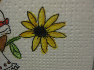
A close up of the flower shows how the ink spreads. I've been trying to take MamaC's suggestion to give it some space to move. On my color swatches, I draw a circle to see where and how the ink moves on the paper. This is where I'm starting to understanding how the paper you choose can make a big difference. I will be trying some of the papers that have been suggested, such as Gina-K, Papertray (sp?) Ink, and one designed for copics by the maker of copics markers.

Her dress and pants appear a bit lighter than the actually are, but the blending is pretty good. Love the grass color, too.

Close up on the top of her dress and face coloring. Can you tell I used a magnifying glass? And still didn't stay in the lines! It's looks better here than actual, so I think I need to lighten up the shades on the face next time.
More practice swatches:

Two swatches of my card. I tried several techniques, like the white highlighting on the blue cap with an opaque pen. On the red cap swatch, I used a clear embossing pen on the areas where there was a tendency to smudge with the printer ink. Around the eyes it shows that too much or misplaced embossing blocks the color from saturating, so it's lighter around the eyes.

Tried to correct with an opaque pen. Clearly I need to practice more or give up all together.

More smudging. After watching Arlene's video, I'm sure I could go back and
correct that oopsie without leaving a trace.
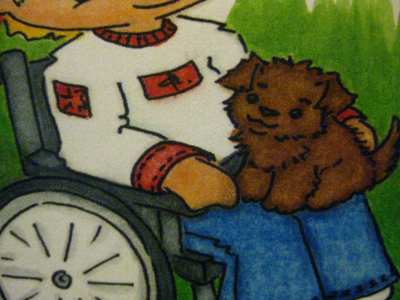
Love the coloring on this swatch, with the exception of the darkening of his little hand. Love, love, love the blending on the jeans Happy with the wheelchair coloring, face hair, and his shirt is very well done. The colors are bright and vibrant. It's so important to write down the numbers of the markers you use as a reference to duplicate blends that you like and may want to do again. The cute little puppy and the boy's hair came out pretty good every time.

I must have used the magnifying glass on this one because that's the only way I could have gotten this area so clean with no smudges.
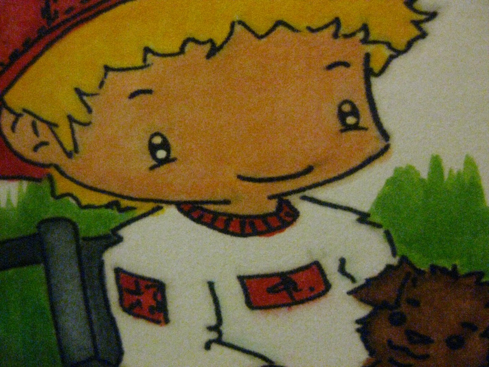
The coloring on this one is very good. Notice how much better the eyes look on this one, even though there's a little oopsie with the eye on the right and some smudging around the lip and cheek.

Notice how orange the skin looks and the opaque pen I used on the eyes. Much better than previously but best for me to leave the eyes alone. From Arlene's video I now know I can use my colorless blender to "lift" some of that color off and lighten it up.
So there you have it. All my oopies have been laid bare. Hope it helps someone. I know I'm helped by what I find shared on the MB in blogs and YouTube videos that other have shared. Thank you for sharing and ...
Happy Crafting!
Sweet card! I think you are doing very well with Copics! Keep it up!
ReplyDeleteCarolyn
http://cccsraproom.blogspot.com
Very cute! Love your coloring!. TFS
ReplyDeleteLove your coloring. Your card is lovely. TFS
ReplyDeleteLove your coloring. Your card is lovely. TFS
ReplyDeletePam