Saturday, February 23, 2013

Markers, a scanner, and PhotoShop

So, I got my new scanner all set up to play around with this picture.  This is one of my Sassy Studio Designs.  It's called "Christmas Present."  In case you weren't aware, Regan at SSD has decided to put family first and spend more time with her little boy.   So there will be no more freebies from SSD on Fridays.  Total bummer!


This photo shows the colored image on copic coloring card stock.  This is the image I scanned onto the computer to use in Photoshop.  If you look closely, you can see that I could not have used the same markers when coloring her bottom bow.  The bow is the actual color I wanted to use and I colored it first.  However, it's obvious I did not use the same maker for the other part of her clothing.  Why I thought this would be a good image to play with in Photoshop and see what I could do.

 
I purposefully colored her very dark with my tan Promarker.  It was nice to be able to manipulate the colors.  Here the color of the entire image, her skin, hair, and clothing is lightened.   The difference in the colors is more noticeable, too.

 
Even lighter here.  And I wanted to try a technique of going back over the hair to give it some thickness or fullness with one of the grey markers in areas throughout the hair.   So I printed her out and worked with markers on the new Photoshop image and scanned it again.


This is the final result.  But you know me.  I never know when to really leave my images alone, so I kept playing with it.  At least when you're working on the computer you can undo or not save any results you don't like. :)  I still wanted to see if I could get those red colors looking more the same.
 
 
In the process of trying to get the red colors to look more the same, I had to lighten her up quite a bit.  But this is where I left it.  I think I should be able to fix all the flaws in this image, but I don't have those skills yet.  So I'm sure I'll pull her up one day and play some more in Photoshop and learn something new and wonderful.  I would love to be able to fix the darker shading lines on her arm, make her blush a bit lighter, and of course, fix those reds.  Then one day I should be able to change the color of her clothes entirely.  Woooo, hoooo! 

Isn't technology amazing.  I can scan all of my colorings and print them from Photoshop.  If I had to do 100 invitations, I could just print them off.  Of course, they'd be flat, so I'd have to do some embellishments or print off extra and use pop dots to give it some dimension.  I think these are things I should be able to do with Photoshop.  But you all know I only bought it because it was a good price and lots of you sang its praises and told me it was worth it.

Time will tell.  My Photoshop adventures have begun.  But for now I'm back to my markers.  I don't have the patience to work with Photoshop often.

I hope you found something inspiring or helpful from this post.  Keep coloring and crafting, and stay out of trouble.  As always --
 
Thanks for stopping by!
 
P.S.  When you leave a comment, I always click on your names and visit your blogs or leave you an e-mail.  Just saying :)
 

Sunday, February 10, 2013

You Can Do This With Just One Marker

It's been over a week since I last posted something.  I've been coloring and have lots of swatches.  There's something I would like to tell you about each one of them.  Don't know if I'll get through all of them, but some of the most memorable ones I know I'll post.  a Robert Jackson image called "The Bather."

This is something I've been wanting to demonstrate about Promarkers.   This picture was colored with only one Promarker color, tan.  That's it.  Each layer of color gives you a darker, deeper color in the same tone.  I'm not sure how many layers there really are in the first picture, but I figured it would be about two or three at the time I started with the pictures.  This beautiful image is one of Robert Jackson's, and it's called "The Bather."

2x or 3x
 
4x
5x
7x
 
8x
Once I got to this point, I figured I'd just go all the way.  So the rest of the pictures show the color changes as I put down each layer.  The last picture that shows some of the different color levels or tones you can get from just one color of marker.


Of course this works with any of the Promarkers as well as other markers.  It seems to me to be more noticeable with Promarkers than Copics because Copics have lots of colors.  With Promarkers you have some "in between" colors that are "missing."  By just adding layers of colors, you can pretty much get some of those "missing" colors with Promarkers, and probably other alcohol markers, allowing you to do a pretty good job of blending and shading.   If you could see close up you would notice I even fuzzied her slippers and added texture to her hair. Happy, happy, happy.
 
Go play with those markers, people.  Take something out and color it.  This is the only way you can find out how the markers work so you can make them work for you. 
 
Keep coloring, crafting, and stay out of trouble.  As always --
 
Thanks for  stopping by!

Friday, January 25, 2013

A Challenge, Some Hair, Some Skin, and a Recipe

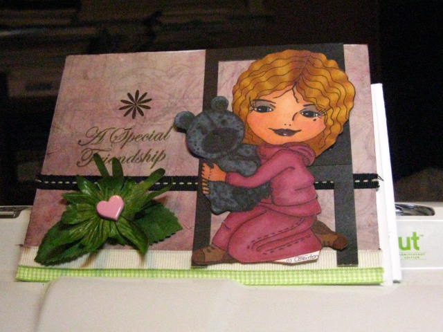
I've completed a card for the Outlawz Creative Freebie Challenge.  We're given two images to color.  To qualify for the next challenge and two more images, you just need to color one or both of the images and post your project.

I wanted to try a new hair color combo and a new skin color combo, and I also wanted to try fur on the bear.  The bear is cute, but it's not furry to me.  So I'll have to keep working on that.

What I want to show you in these pictures is that there is no set way to color.  You learn the basics by learning what others do in videos, on blogs, or in tutorials, classes, and what you read in books.  After that it's up to you.  If you want to do flicks or circles, if you want to start with your light color or your dark color, if you want to start with the skin first, or the hair first, these are all choices you make to bring a coloring to your liking.  You're the artist.


Here goes.


I started with the light and colored the entire area with YR21.


Then I used the darkest color, YR24, and colored in where I felt the darkest areas were.


 And lastly, I used the medium color, YR31, to fill any the areas between the dark and light.

 
Some folks would stop here.   I didn't.   I went over the entire area with the lightest color, YR00.
 
 
Once that's done, you just have to work with it, tweak it here and there, to make it your own.


I used the same technique on her clothes, started with the lightest pink.

Think of coloring like a recipe.  First you make it according to the directions.  Then add a little of this, a lttle of that, not so much of this, not so much of that and, voila!  Now it's your recipe.  Coloring is no different.   Sometimes you have to make it over a couple times before you get it just right.  If it's something you enjoy, you'll try again and again to get it just right.

I really hope this helped to inspire you to continue coloring.  It is so fun and relaxing.  Who doesn't color?  We're been coloring since we were small children.  Bet your coloring now looks better than when you were five.  LOL

Here's my finished card.


*NOTE:  Trina pointed out that I had put the colors for the jacket in this image and not her hair.  I have corrected them.
Hair - YR21, YR24, YR31, YR00
Jacket - R81, R85, R83

As always --
Thanks for stopping by!
Challenges Entered:


Saturday, January 19, 2013

Challenges

Here's another card I've done for  to enter challenges.  I used a Sherri Baldy image, and it was a freebie.

Sherri's images are a little different from what I usually color.  So it's no surprise to me that this card is a little different from the ones I usually make.  I just went with whatever my pens and inks wanted to do.  I used 15 markers.  Sort of reminds me of some of the scribbles or doodles or mixed media -- whatever you call it -- that seems to be trendy right now.  Hey, if a dot on a canvas can be considered art, then I guess there's a place for me to hang this little sweetie.  Hope you like her. I do. 

The papers are from Jen Wilson's Totally Girl pack and Paper Pizazz' Disney Princess Papers.  The embellishments and sentiment comes from my stash.  I used both Promarkers and Copics.  I wanted her to have really black hair.  If you look really closely, you can see that her hair is blue and black.  It's Copic marker B28, Royal Blue.  This color seems to work really well for me for blue/black hair.

 
I hope you enjoyed your visit, found something useful,  and were inspired to color.  As always --
 
Thanks for stopping by!
 
Challenges I entered: (Anything Goes)
This is what happens when I don't color :)

Friday, January 18, 2013

New Card for Challenge

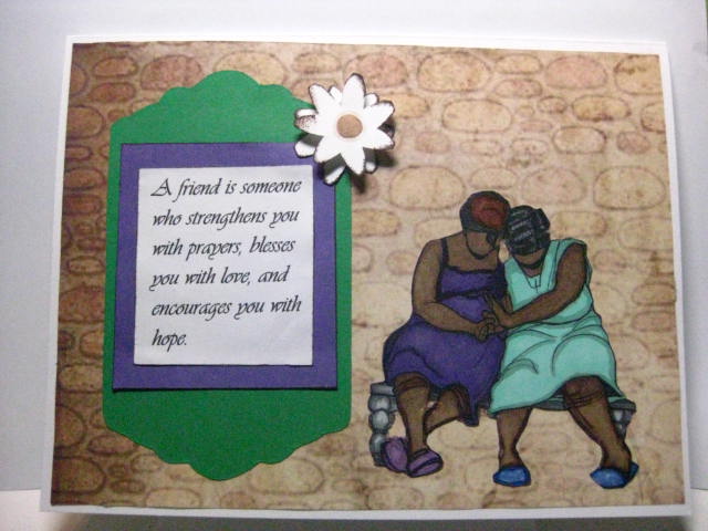
This card is for the Robert Jackson Digi image Challenge Straight From the Heart.
RJ 2013 #2

Tuesday, January 15, 2013

More Ugly and A Bit About Paper

Okay, so this started when I accidentally printed out one of my Sassy Studio Designs images on a bright white, 97-pound premium color laser paper.  I set out to color with my Promarkers to see how the ink would work with this paper as it's not as thin as regular copy paper. 

So far so good.  Dress and arms look really good. 
 
On to face and hair.  Now, it looks good from here --
 
-- but -- Yikes!  Hair color bled onto face and eye whites not white.
 
Okay, no problem.  Use the blender pen to push color back into her hair and white pen to white up the whites of her eyes.  Looks good, but my paper is a wrinkling.  I know why it's wrinkling, but I'll see if you guess it before I tell you. 
 
Used a little eye liner.   That left one looks wacky.  I give up. 
 
Why did this happen?   This is the back side of the coloring. Wow! That's a lot of ink! I could tell right off that I was going to use a lot of ink because even though I tried to color lightly, it took several go overs to lay the color. Normally I would have stopped and tossed early on, but thought it would make a good post on papers.
 
This weight of paper is used for brochures.  It's heavier and shinier than regular copy paper, so it seems like it may be a good paper for coloring with markers, especially if you're going to be cutting your image out.  For small images, maybe.  But for a large image, you'll use (waste) too much ink.  Honestly, if I were using my Copic markers, I would have done an ink check and would never have used them with this paper.
 
This paper literally began to fuzz up when you work in one area too long.  I colored as lightly as I could.  I knew the paper couldn't soak up that much ink and not tear.  I used the extra fine nibs sparingly as it would tend to weaken the paper, making it prone to fuzzing. 
 
What paper you use is sooo important.  It can make or break your project and increase your frustration using markers.   Markers are best when used on paper made specifically for alcohol inks.  Some of them don't bleed to the other side at all.   None.  Nada. Nil.
 
Girlfriend's dress is kicking. 
 So off with her head.  I'll give her a new one and use this image in a project in the future. 
 
As always --
Thanks for stopping by!

Friday, January 11, 2013

Some Cards for You

I've got cards for you today.   Both of these cards were made for challenges -- Robert Jackson Digi Challenge at  Scraps of Color and Creative Freebie Challenge at The Outlawz Challenges.   Since I gave up making them, they look a whole lot better. LOL


RJ 2013#1
 
CFC123012
Hope you like them and they encourage you to keep coloring.
As always...
Thanks for stopping by!